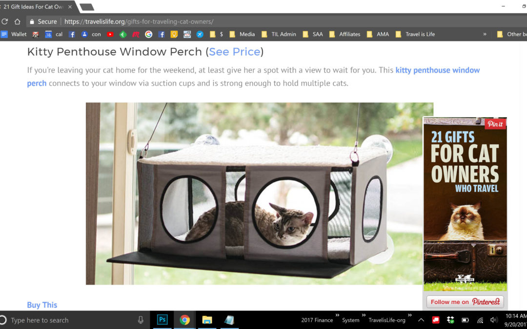
I feel like there's never a great place to insert a vertical pin into a blog post. Somehow the vertical orientation of the Pin manages to look weird or out of place when embedded into my posts. So I came up with this idea for a solution: Pin It Popup Plugin for WordPress.
Here's How It'd Work
Your vertical Pin graphic would pop-up in the post as the reader scrolled 50% down the page (or whatever % you input) with a call to action to Pin It. When the Pop-Up was minimized, it'd appear as a little red push-pin floating icon. See mockup images below.
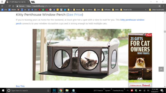
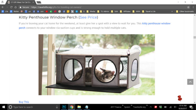
How You'd Add The Pins
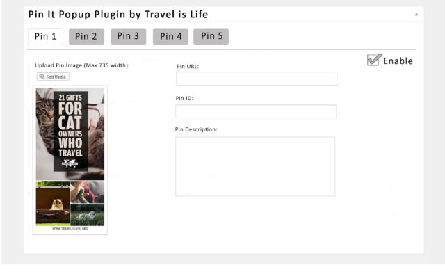
When creating a blog post, a separate section would appear under the post content (similar to how Yoast SEO appears or where your Excerpt section appears), and you'd be prompted to input:
(1) Pin Image(s) – up to 5. If you add more than one, left right arrows appear under the Pin so the visitor can choose which one of your vertical Pins to use, or on mobile they can swipe left/right.
(2) Pin Description(s) – If none is inputted, description defaults to Meta-Description or Excerpt.
(3) Pin URL(s) – If none is inputted, URL defaults to post-URL.
(4) Pin ID(s) – Left blank if none is submitted.
And the above options would translate into meta-data for Data-Pin-Description, Data-Pin-Media, Data-Pin-URL, and Data-Pin-ID.
The Plugin Settings Options Would Include
Pops Up: (1) ___% scroll (2) ___ seconds (3) On exit
Floating Push Pin: (1) Always Appears (2) Never Appears (3) Only Appears After Pop-up
Floating Push Pin Position: (1) Bottom Left (2) Bottom Right
Color Scheme: (1) Red (2) White
Dimensions: (1) Responsive (2) __ x __ pixels (3) %-Width/Height of Browser
Enable: (1) Yes (2) No – The Pop-Up would only work if the Post or Page contained a Pin image. Otherwise the Pop-Up or the Floating Push Pin would not appear. This option lets you temporarily disable/enable all at once.
Disable on Pages with Widget: (1) Yes (2) No
Widget
The plugin would also include a Widget that you could stick into the sidebar. That way you could use its functionality to house your Pins without necessarily using the Pop-Up feature. The Pin(s) would appear in the sidebar same as they do in the Popup, only all the time. The sidebar, to me, seems like a better place to put a post Pin, but there's currently no easy way to do that.
Options: (1) Hide/disable on Mobile (2) Pop-Up on Mobile
Here's a mock-up of the widget in action on the sidebar using my friend Mary Jo's blog:
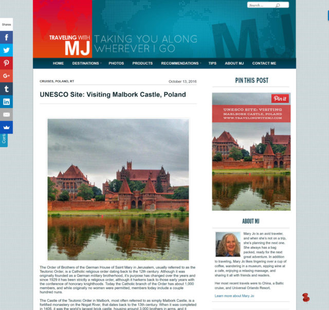
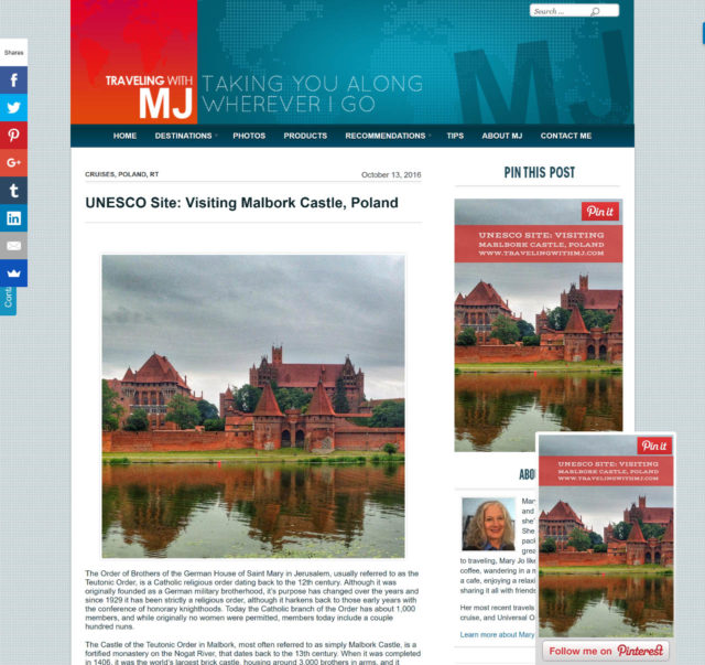
What Do You Think?
(1) Would you use it?
(2) What additional options would you like it to have?
(3) What, if anything, would you pay for this?
Drop a comment. Let's discuss.
Additional Ideas
I posted this in my Facebook group which led to a few ideas:
(1) If there was an option to “Pulse” instead of “Pop-Up”. So the floating push-pin would either illuminate once or twice or push-in/push-out on the page instead of popup. It'd bring attention but not take over the content as pop-ups do, until clicked.
(2) Offer a free trial and then a yearly subscription for updates.
(3) Customizable CTA verbiage
(4) Pre-sell 100 lifetime accesses to people who'd want to beta-test it in order to fund the development. And then offer it as a yearly subscription to the public. I think somewhere in the $29-$49 / year range would be the sweet spot but i'd have to do more research. It's impossible not to have a subscription now a days if the plugin was to remain updated. But the initial 100 would get lifetime access to everything an all updates for funding the development.
Q&A
Some questions I've gotten via direct message.
Kate: Hey Paul. I just read through it and need to do a little more in depth looking. My first questions would be and some readers might ask this — why don't you just put the photo at the top of the post? Why not use Social Warfare? Is it google compliant? Not sure if you answered them in the post, which i can read through more but this would be my initial thoughts.
Me: Good questions. “Why don't you just put the photo at the top of the post?” People aren't ready to share an article they haven't read themselves yet. That's why sharing CTAs work better at the end of a post or mid-way down. You could simply put the Pin(s) at the end of the post like I do but that still leaves the problem of vertical pins not fitting great into typical post content. Lastly, for folks big into Pinterest (that being their most important social share), this type of pop-up CTA could generate more shares than a typical share bar. “Why not use Social Warfare?” Doesn't seem to do the same thing. SF looks like a general floating-share button (albeit a good one) without the emphasis on Pins. “Is it Google compliant?” I'm thinking you're referring to “Popups” being blocked in Chrome and other browsers? This type of pop-up would work in a div-overlay, similar to how Sumo App or Icegram or any browser-overlay plugin delivers in-browser popups.
It's just an idea for now. I haven't seen anything like it before. One problem with typical social share plugins is that their non-platform specific, which leads to options, which leads to non-action. Sharing on Pinterest is very non-committal in the sense that people regularly share 30+ pins a day without being a burden to their followers, unlike if you did that on FB or Twitter. So for Pinterest-heavy bloggers, a specific CTA popup for Pinterest will likely increase rePins more than just a general social share CTA. That's the idea at least. 🙂

